

Inside
Virohan
Virohan Pvt. Ltd.
Gurgoan, Haryana India
Motion Designer
Current Role
1.8 years
Experiance
June 2024 - Current
Timeline
Photography
&Videography
-
Talent Shoot
-
Campus Shoots
-
Founders Shoot
-
other

Note: Before You Scroll Further
Except for the brand logo and descriptions
all visuals and designs showcased here are original works created by me
Some showcased designs are copyrighted and owned by the company, included here only as a showcase of my work
Brand & Identity

About
Virohan is an ed-tech organization focused on bridging the gap between healthcare job demand and skilled professionals. It delivers structured courses, practical hands-on training, and reliable placement support to help students build strong careers in the healthcare sector. Using a tech-enabled learning platform, interactive content, and industry-driven curriculum, Virohan equips learners with the confidence, knowledge, and real-world skills needed to succeed in modern healthcare roles.


The logo animation is a custom animation designed for the brand, created for use across various mediums to introduce and reinforce brand identity.
Sub
Identities
SureStart

by Virohan is an industry-integrated learning program that blends classroom education with hands-on training through leading healthcare partners. It prepares students with real-world skills, early clinical exposure, and job-ready experience, creating a strong, seamless pathway from learning to employment in high-demand allied health fields.
The Vital Shift

is Virohan’s podcast series highlighting the growing importance of allied health careers. Through insights and real stories, it guides students and parents toward meaningful, future-ready healthcare paths. The series offers clarity, inspiration, and a fresh perspective on the essential impact allied health professionals create every day.


Design
Concept
& Strategy
The design is created to establish a clear visual link with Virohan, while allowing each identity to express its own meaning. A black typographic base is consistently used across all identities, with red elements acting as expressive details derived from the concept of each initiative. This approach is applied across all identities introduced under Virohan, balancing design consistency with creative flexibility making each identity feel distinct & instantly recognizable as part of the Virohan brand
The
Visuals
and
Imagery
Visual & Guidelines
The imagery is kept clean, clear, and minimal
to reflect the atmosphere of the medical field. Bright white visuals create a sense of trust, helping viewers instantly connect with the healthcare environment. This premium, minimal style reinforces credibility and aligns with the expectations of the industry.


The majority of the brand’s visual assets (90%) are self-photographed, crafted with precise lighting, controlled exposure, accurate color balance, and thoughtful composition. This approach ensures consistency, clarity, and flexibility, allowing the assets to adapt seamlessly across multiple formats, platforms, and communication needs.


The photographs presented above are original works and are not AI-generated.
End of Brand Brand & Identity
Motion Designs
These motion works are shown only for portfolio display and are not intended for commercial use.
Digital Standee
The visuals were designed using bold compositions and high-contrast typography to ensure clear readability on a small-format screen viewed from a distance. The content was structured as a seamless video loop, with each frame holding for 3–4 seconds to allow adequate viewing time in a fast-paced exhibition environment. Brand-aligned colors and clean text animations were used to communicate key messages effectively while maintaining clarity and strong brand presence.
Version 1
Purpose of the Video?
The video was designed specifically for DIDAC India, a B2B education and skills exhibition, with the purpose of delivering a clear, business-oriented message to industry professionals and stakeholders.
Design Approach
Since DIDAC India is a B2B event, the entire motion template was created with a text-animation-driven approach to align with a professional, business-centric tone, ensuring clarity and impact in a commercial setting.
Imagery & Design Elements
The motion design consists of 2–3 key imagery frames, each held for 3–4 seconds in a seamless video loop, making the visuals both engaging and easy to digest within a high-traffic exhibition environment.
What is DIDAC?
DIDAC India is Asia’s leading B2B exhibition and conference for education and skill development, bringing together global educators, policymakers, and edtech companies to showcase innovations in learning, training, and educational technology.

Mock up & purpose
of the design

Frames


Format
UHD (1920px x 1080px)
29.97 fps H.264
Contrast Ratio
4.5:1
Duration
1:45 Min
Software
Version 2
Design Approach
Since the target audience is students, the motion design template integrates imagery that highlights campus life, student experiences, and future career opportunities. The design is specifically crafted to evoke aspiration, establishing a strong connection between the university’s offerings and the students’ ambitions, helping them visualize their educational journey and future success.
Imagery & Design Elements
The motion design features more imagery, showcasing scenes of student life, classrooms, and the real-world application of learning. These visuals are structured in a seamless loop, offering a quick, engaging overview of the university’s environment, making it appealing and relatable for prospective students.
Purpose of the Video?
The video was designed for university digital screens, with the purpose of engaging and inspiring students by showcasing the university environment and its educational opportunities. It aims to help students visualize their future and feel motivated about their academic journey.

Mock up & purpose
of the design

Frames


Format
UHD (1920px x 1080px)
29.97 fps H.264
Contrast Ratio
5.4:1
Duration
0:27 Min
Software


Post-Production Pipeline
Designed and implemented a structured post-production pipeline for The Vital Shift podcast to streamline workflows across internal and outsourced teams.
Framework
What does this workflow achieve?
Workflow
Efficiency
through streamlined Coordination and clear
execution
Effective
revision cycles
to reduce rework and
manage feedback efficiently
Quality
consistency
ensured through standardized checks across all deliverables
Color
Grading
Worked on cinematic DI and clean color
correction to ensure consistent tones,
balanced contrast, natural skin tones,
and a polished, cohesive visual look
across episodes.


Title Animation
The Vital Shift podcast
animation follows an abstract visual approach, built using brand colors, simple geometric forms, and typography inspired by the medical field. The intent is to establish a distinct character for the “+” symbol, gradually guiding the viewer toward the full logo reveal.
The transition into a black background marks a visual shift, where square ribbon elements move through a 3D space to create depth and progression. This motion represents the evolution of healthcare and a transformational shift within the medical space.

Animation Snippets


Podcast Hook


Podcast Intro

YouTube Link
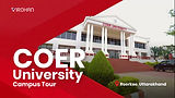
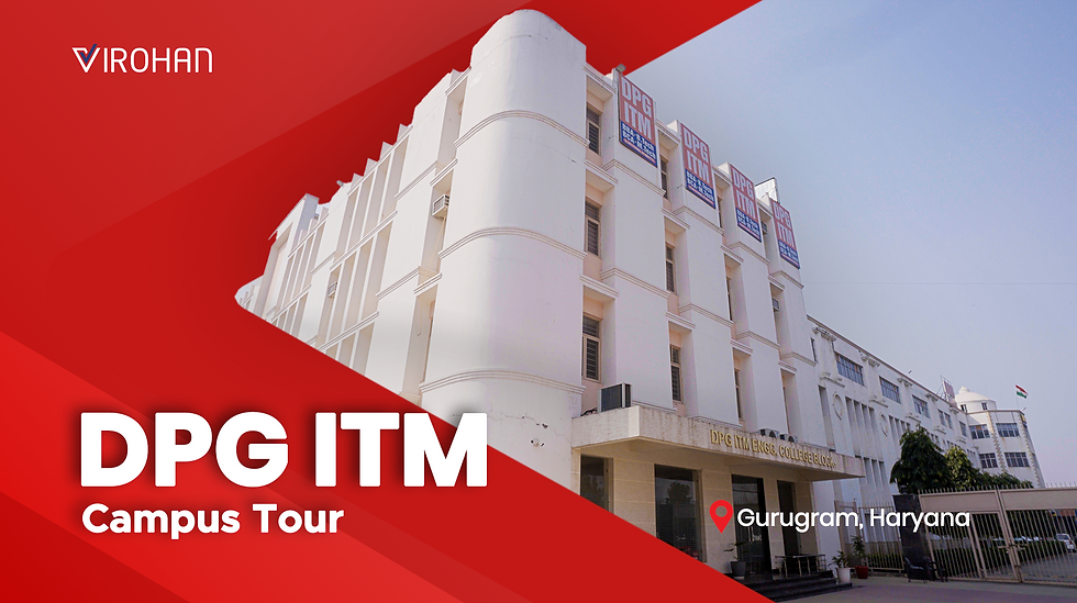
Campus walk-through
Purpose
To create campus walk-through videos for multiple campuses across India, designed as a sales support tool to aid student admissions. The videos help prospective students visually experience the campus infrastructure, facilities, and overall environment in a clear and engaging format.
Design
A consistent visual design system was developed across all walkthrough videos to ensure uniformity. Each video features a custom-designed thumbnail that acts as an interactive entry point when clicked. The visual language focuses on clean, simple shots highlighting campus infrastructure and learning environments, making the content easy to understand and effective for sales presentations.
Process
The project was executed end-to-end by me, including shoot planning, on-ground direction, filming, and post-production. Campus photographs were captured simultaneously in collaboration with a colleague, ensuring visual alignment between photo and video assets. This hands-on approach maintained consistency in quality, framing, and pacing across all campus walkthroughs.

Intro Animation
End Animation


Caption/ title Animation


20+ Campus Walk-through Videos delivered across multiple formats
6+ Month Long Project executed with consistent quality and structure
Shot Across
8+ Locations throughout India
YouTube Link
Reels
Short-Form Contents
Simple, aesthetic reels designed for clarity and engagement. Focused on strong visual storytelling and clear message delivery, helping drive a 15% increase in views and followers.


Other
Concepts


End of Motion designs
Creatives
Explainers
Thumbnail


Program
Explainer


Campus
Walk-through


Perf Asset
Thumbnail
Social Media Creatives


End of Creatives
Print Design

ID Card


End of Print designs
Photography & Videography
Asset & Management
Asset Bank System
A centralized design asset system created to organize and share design resources efficiently, improving accessibility, reducing search time by ~80%, and supporting smoother collaboration while maintaining consistency across marketing and brand outputs. A monthly review process ensures the asset bank stays updated, accurate, and easy to use.
What does this system achieve?
Asset accessibility improved
by centralizing previously scattered, individually owned files into a single, shared system.
File sharing efficiency improved
by making approved assets easy to find, access, and share across teams.
Brand design
consistency improved
by ensuring teams use the latest approved design assets across marketing and brand outputs.
Assets kept
up to date
through a structured monthly review process.
Software & Subscription
Helped manage software and subscriptions by tracking usage and budgets,
and ensuring timely renewals so teams had uninterrupted access to required tools.
Production equipment's & Rentals